Landing Page for a Personal Branding Growth Agency
2025
freelance

Overview
The original landing page for Editoz Accelerate had strong content and a clear offering, but the structure made it harder for visitors to understand the value quickly. I focused on improving clarity, strengthening calls-to-action, and creating a smoother flow from introduction to application. The redesign highlights outcomes, trust signals, and a direct path to next steps, with a layout that works well across desktop and mobile.
Scope
- UX review of the existing landing page
- Wireframing and layout planning
- Copy hierarchy adjustments
- UI for desktop and mobile
- Interactive prototype and revisions
Process
-
Problem Framing
I started by reviewing the existing landing page carefully. Took screenshots of every section and placed them down. Then noted down beside each part to highlight issues like weak CTA placement, unclear messages, and a long path to conversion.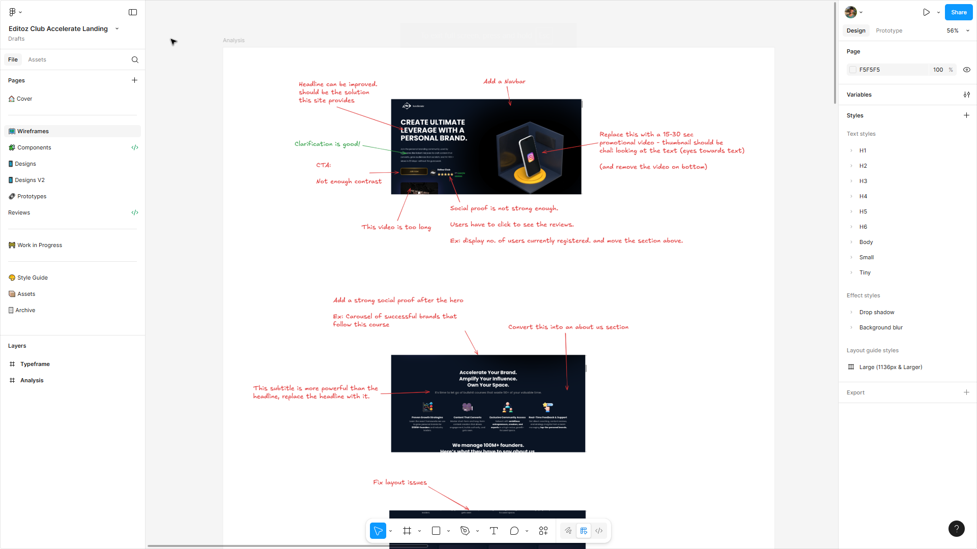
-
Research
After that, I took a look at high-performing personal-branding and coaching pages to understand how they communicate outcomes and trust. Also took visual design inspirations from various sources. -
Wireframing
Then I did the IA and low fidelity design to set the structure. Reordered the outcomes, social proof, and CTAs so visitors could make decisions faster. Goal here was to convice the visitor to take an action. I also finalized the UX copy in this phase.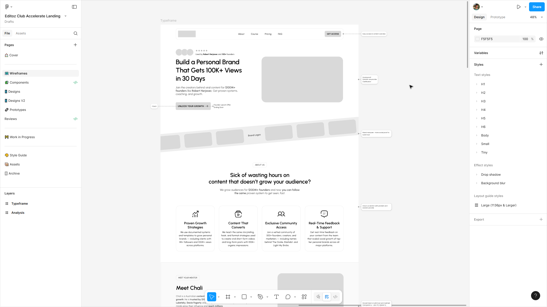
-
Design
Once wireframing is done, I built a small, reusable component library in Figma and applied a consistent system for typography and spacing. Also designed responsive screens for both desktop and mobile and a clickable prototype to show flow and behaviour.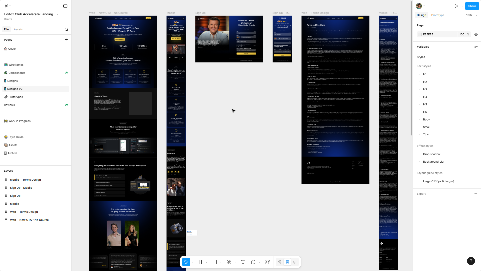
-
Review - Refine
Finally, I presented the prototype, gathered feedback, and refined the design based on stakeholder input. After final approval, I handed the design to development and continued working closely with the developer to bring the redesign live.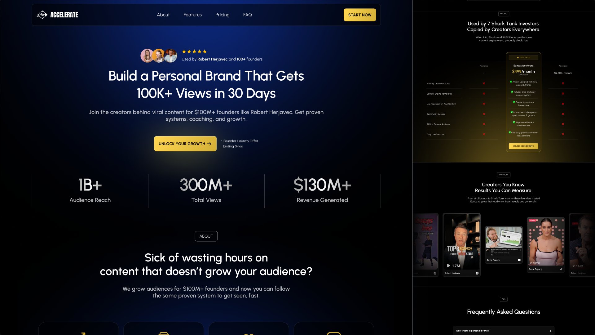
Results
- The page structure was reorganised to make information easier to follow.
- Copy was rewritten to communicate outcomes and value more clearly.
- Social proof appears earlier and supports trust.
- The visual design was rebuilt with a cleaner, more consistent system.
- The new layout guides visitors toward the CTA with less friction.
Deliverables
- UX audit notes with annotated issues
- High-fidelity UI for desktop and mobile
- A prototype demonstrating flow and interactions
- Exported assets and component specifications for development